


There’s a particular kind of relief that comes from opening a flight search tool with zero fixed dates in mind. No wedding to catch, no work deadline dictating a Tuesday departure, just a rough idea and a willingness to go whenever the price is right. Most people who search for flights online never scroll past the first page of results, which means they miss a quieter part of Google Flights that quietly reorganizes an entire calendar year around cost.
That part of the tool doesn’t announce itself loudly. It sits behind a small calendar icon, waiting for someone curious enough to click it.
Finding the Calendar Icon Where the Magic Happens

The entry point to this feature is easy to miss if you’re used to typing in exact dates and hitting search. To open the calendar, you click on either of the date boxes in the top right of the screen, which show the days currently selected to leave and come home. From there, a much larger view opens up, one that stretches well beyond the two dates you originally typed in. Clicking the calendar icon will display a calendar view showing prices for the whole month. It’s a small interaction, but it changes the entire framing of the search from “what does this specific flight cost” to “when is this route actually cheap.”
What the Price Graph Actually Shows You

Once you’ve run an initial search, a second tool appears just above your results called the Price Graph. If your travel dates are flexible, clicking Price graph lets you explore fare trends by month or week. Rather than a simple list of numbers, it renders as a bar chart, and it shows you a bar chart of what pricing is for the flights within a 2-month time frame, letting you see price trends by day. You can keep scrolling the graph forward, month after month, watching the bars rise and fall as seasons shift and demand changes.
The Date Grid: Comparing Every Combination at Once

Sitting next to the Price Graph is another view called the Date Grid, and it works a little differently. This tool displays a table where your departure dates run across the top and return dates go down the side, showing the total price for each combination, which is great for round-trip flights when you want to see if leaving a day earlier or returning a day later will lower the cost.
One documented example involved a New York to Los Angeles search where a traveler entered dates from May 10 to May 14 at $320, but the Date Grid showed that flying out on May 9 and coming back on May 15 dropped the price to $238, an $82 savings just by shifting dates by one day in each direction. That’s the kind of detail a simple search box would never reveal on its own.
How Google Flights Color Codes the Cheapest Days

Both the calendar and the grid rely on a simple visual shorthand to keep things readable. When you click in to set your travel dates, Google Flights brings up a two-month calendar, immediately showing a date-by-date breakdown, and dates shown in green let you know they’re the lowest price you can depart or return. Sometimes the savings from choosing a green date over a nearby one are modest. Other times they add up to real money, since shifting your dates slightly can save twenty dollars or more, and other times those savings can be hundreds of dollars.
The Best Tab Versus the Cheapest Tab

Google Flights has also split its main results into two distinct categories, and understanding the difference matters when you’re chasing the lowest possible fare. When you search for flights, results automatically appear in two tabs, Best and Cheapest, where the Best tab shows flights offering the best trade-offs between price, convenience, and ease of booking, while the Cheapest tab prioritizes low prices and includes additional itineraries and prices from online travel agents.
Choosing the Cheapest tab can mean accepting some trade-offs, such as self-transferring luggage between connecting flights or flying through different airports in the same city on the onward and return legs. It’s worth glancing at both tabs before deciding, since the price difference can occasionally be larger than expected.
Price Insights: Telling You If a Fare Is Actually Good

Beyond raw numbers, Google Flights tries to add context to what you’re seeing, through a feature it calls Price Insights. One travel writer’s search from New York to San Francisco showed a flight that was $93 cheaper than usual, with the typical range falling between $245 and $415, signaling that it was a good time to book. The tool also flags the opposite situation, letting you know when Google Flights predicts with high confidence that prices for a trip will not drop before departure, a prediction based on analysis of past price trends, though there is always a chance future prices behave differently. That last caveat is worth remembering, since no prediction tool can account for every sudden shift in airline pricing.
The Explore Map for Travelers Without a Fixed Destination
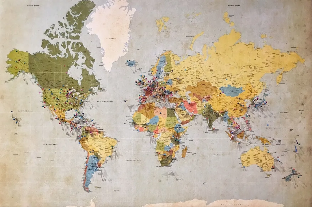
For anyone who cares more about a cheap trip than a specific city, there’s a separate tool called Explore. It shows the cheapest destinations from your home airport for a seven-day trip in the next six months, and if you want to narrow things down, you can click the date box to choose a trip length or a specific month within that window.
Using it is straightforward, since you simply tap Explore near the top of the page, tap the calendar icon, toggle to flexible dates, select a time frame or trip length, and the map populates with trip options, the cheapest available flights highlighted and easy to spot. It’s a genuinely useful starting point for anyone in the “somewhere warm, sometime in spring” stage of planning rather than the “Paris in June” stage.
Setting Up Price Tracking for Longer Time Horizons

If you’ve found a promising route but aren’t ready to book, Google Flights lets you keep an eye on it without checking manually every day. You can effortlessly track prices for specific travel dates or for any dates if your plans are flexible, and set up tracking for multiple routes at once while opting in to receive email updates when prices change. This flexible tracking has become more capable over time, since these alerts have gotten even more powerful, allowing you to get price alerts for specific dates or now for almost any date, which can help you find a bigger bargain if you’re flexible on travel. For a route you’re watching months in advance, this quietly does the legwork so you don’t have to.
Why Fares Move So Much in the First Place

None of these tools would matter much if airfare stayed steady, but it doesn’t. Flight prices seen today on the Explore map could look wildly different tomorrow, since airlines now use real-time dynamic pricing algorithms, so fares continuously change based on demand, as research from Yale Insights indicates. That volatility is exactly why a calendar view matters more than a single search result. Seeing a whole month laid out at once, rather than one date at a time, is the only reliable way to spot where the pricing algorithm has, at least temporarily, left a gap.
Getting the Most Out of the Feature

The calendar, the Date Grid, and the Price Graph work best when used together rather than in isolation. Combining the calendar view with price tracking tools can significantly enhance your ability to find the best flight deals, since the calendar gives a quick visual overview across a month while the date grid and price graph add more granular insight into price trends. It also helps to stay realistic about what the tool can and can’t do, since Google Flights doesn’t guarantee the absolute rock-bottom price, but it’s still one of the best tools available for finding great flight deals. Treat it as a very well informed starting point rather than a final word, and it tends to earn its keep on almost every trip you plan.
The cheapest month to fly rarely announces itself with a banner or a big red arrow. It usually shows up as a slightly greener box on a calendar you almost scrolled past, or a dip in a bar chart you weren’t expecting. Spending a few extra minutes with these tools before locking in dates is a small habit, but it’s one that consistently pays for itself, sometimes literally.
AI Disclaimer: This article was created with the assistance of AI tools and reviewed by a human editor.