

There’s a quiet kind of genius in the subway map. It takes one of the most chaotic things imaginable – thousands of tunnels, tracks, interchanges, and passengers – and turns it into something you can fold into your coat pocket. But in a handful of cities around the world, the map itself has transcended that purely functional role. It’s become something people frame, collect, debate, and study long after they’ve finished their commute.
Metro maps are much more than mere functional diagrams – they shape our mental image of a city and contribute to an iconic shared identity. These six cities prove exactly that.
London: The Blueprint That Changed Everything
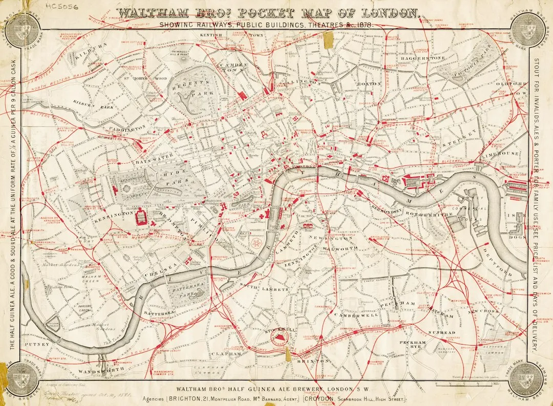
For the iconic London Underground map created in 1931, engineer-designer Harry Beck drew inspiration from electrical circuit diagrams as well as cubist and abstract art. Beck’s revolutionary approach disregarded geographical scale, focusing instead on clarity, with straight lines and equidistant stations, transforming the map into a readable diagram rather than an accurate representation of territory.
Over 80 years since its public debut, Beck’s London Underground map remains the template for the map used today, and at first rejected by Underground management for being too revolutionary, it proved to be an enormous success with the public. Some 850,000 pocket-sized copies of the diagram were printed in the first two months of 1933.
In 2006, the map was voted second-favourite British design of the 20th century in a national contest. Beck’s circuit diagram became the source from which the public transportation network maps of most major cities around the world today are derived. That’s an extraordinary legacy for something drawn in a spare afternoon.
New York City: The Map That Belongs in a Museum (and Actually Is)
In 1972, the Metropolitan Transportation Authority of New York commissioned Italian designer Massimo Vignelli to create a modern, simplified map for one of the largest and most complex subway systems in the world, abandoning geographical accuracy in favour of a rectilinear design with lines intersecting at 45- and 90-degree angles, with each stop marked by a simple dot and a neutral background with brightly colored lines.
Initially criticized for its abstract style, the old New York Subway map eventually gained cult status, even earning a place in the Museum of Modern Art. Vignelli focused on clarity and elegance, utilizing a geometric approach that prioritized a systematic, abstract representation of the subway lines rather than geographic accuracy, reflecting his philosophy that maps should be first and foremost functional tools, not literal depictions of the landscape.
Researchers found that the New York City subway map was the most complex in terms of possible connections, with a total of 161 total possible connections. That complexity makes Vignelli’s achievement all the more striking – he made something genuinely beautiful out of controlled chaos.
Paris: Art Nouveau Woven Into Every Line
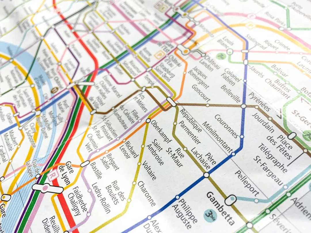
The Paris Metro map is a classic example of a transport map that has become an icon in its own right, known for its density within the capital’s territorial limits, uniform architecture, and historical entrances influenced by Art Nouveau, with cultural significance in the arts that goes well beyond Paris itself.
The Paris Metro map faces a unique challenge: integrating the urban structure with a dense network of lines, where stations are often only a few hundred meters apart. After World War II, Harry Beck attempted to introduce his schematic style in Paris as well, but his proposal was initially rejected. Over time, more simplified maps have been introduced, but the current version still retains elements of spatial accuracy.
Transport design historian Mark Ovenden has noted the landmark Art Nouveau entrances and ceramic-tiled platforms, Art Deco signage, and mid-century murals across fifty of the Paris Métro’s finest stations, alongside the Eiffel Tower and Arc de Triomphe, as visual shorthand for the city of Paris itself. The map, in a sense, carries all of that cultural weight.
Moscow: Circular Logic as Visual Poetry
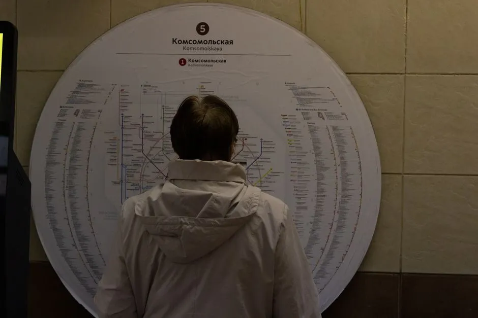
The Moscow Metro map is one of the most visually striking transport maps in the world, using a combination of bold colors, graphic shapes, and Cyrillic lettering to create a map that is both functional and beautiful. The Moscow Metro stands out for its Koltsevaya circular line, which encircles the center and facilitates connections between the radial lines extending toward the suburbs, reflecting the city’s radial layout.
Moscow’s Metro contains a unique feature – the Koltsevaya line, a circular route through some of the city’s most opulent stations, which is great for riders but a headache for mapmakers because it leaves limited space to place the stations inside the circle. Art. Lebedev Studio solved the problem by focusing on legibility rather than geographic fidelity, arranging all the stations as evenly as possible, producing a clean, orderly look with room to accommodate the planned expansion of the system through 2100.
The transport map is not only a tool, but also a notable object of graphic design in a big city. Even if you use the Beck design language, you will get a London map no matter what you depict. The transport system must have a face, and aesthetics is as important as logic. Moscow’s map found its own face early, and has kept it.
Tokyo: Controlled Complexity as a Design Achievement
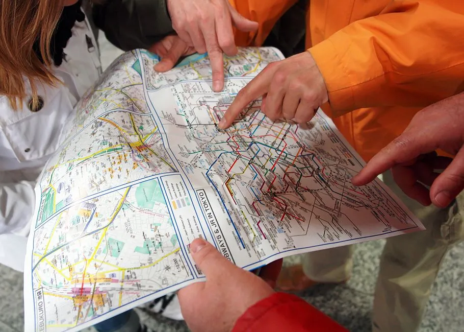
Tokyo’s subway system is perhaps the most complex in the world, and trying to represent that tangle is a tough project that a few firms have tried their hand at. One of the most extensive and busy networks in the world, Tokyo’s metro system is also one of the most complex due to the number of different operators involved, with Tokyo Metro’s 179 stations across nine lines and 195km of track, in addition to the Toei Subway’s 99 stations across four lines and 109km of track.
The Tokyo Subway Map is one of the most complex transport maps in the world, reflecting the complexity of the city’s transportation system, using a layered, three-dimensional approach to represent the different subway lines, resulting in a visually stunning map that is surprisingly easy to read, despite its complexity.
Each line has its own colour, letter, and station number, and several designers have taken on the challenge of trying to redesign Tokyo’s subway map to make it easier to understand. The fact that Tokyo’s map inspires so many redesign attempts is itself a kind of artistic tribute.
Mexico City: Icons Instead of Words
Every station of the Mexico City Metro is prominently identified by a unique icon in addition to its name, because the city had high illiteracy rates at the time the system was designed. What began as a practical accessibility measure became one of the most distinctive visual systems in the world of transit design.
Those pictograms – a grasshopper for Chapultepec, a pyramid for Tlatelolco – give the Mexico City Metro map a quality unlike anything else in transit design. The map reads like a storyboard, layering indigenous history, urban mythology, and contemporary symbolism into a single printed sheet. Riders don’t just navigate with it; they read it.
Mexico City’s subway map, while complex, is less so than those of Paris and Berlin, which is why it is able to introduce more visual complexity without losing legibility. The subway lines are crooked rather than perfectly straight, reflecting the actual geographic layout of the lines. That geographic honesty, paired with the iconic symbol system, makes the map feel deeply rooted in its city.
Why These Maps Matter Beyond the Platform
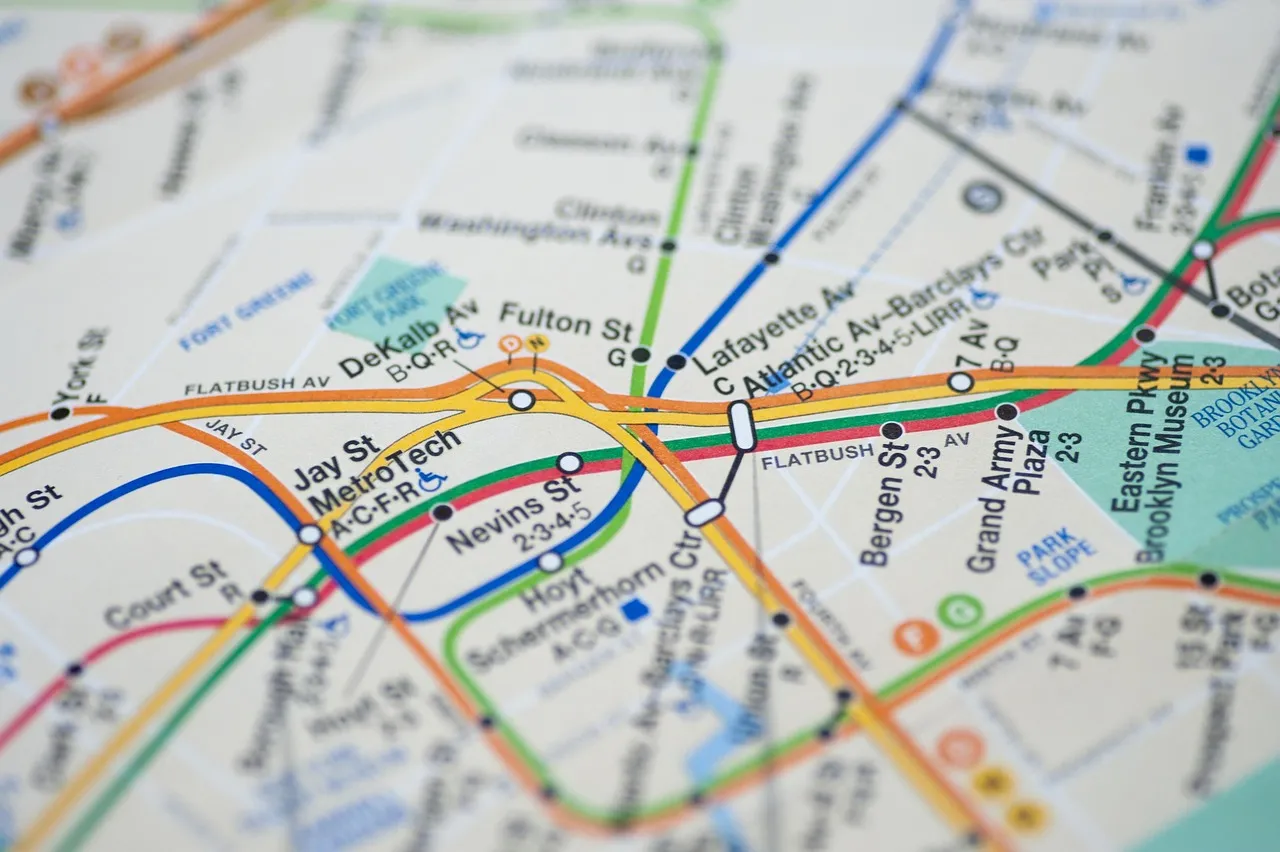
The evolution of a metro map is a textbook case for anyone interested in complex visual identity systems. No agency simply “draws” a metro map – it builds a coherent graphic language capable of absorbing decades of change, new lines, and new uses.
Guiding the millions of passengers who use the subway each day are the maps, some of which are true works of design and urban art. The best of them go further: they shape how residents think about their city, where they imagine its center to be, and how close or distant different neighborhoods feel.
The Cult of the Collector
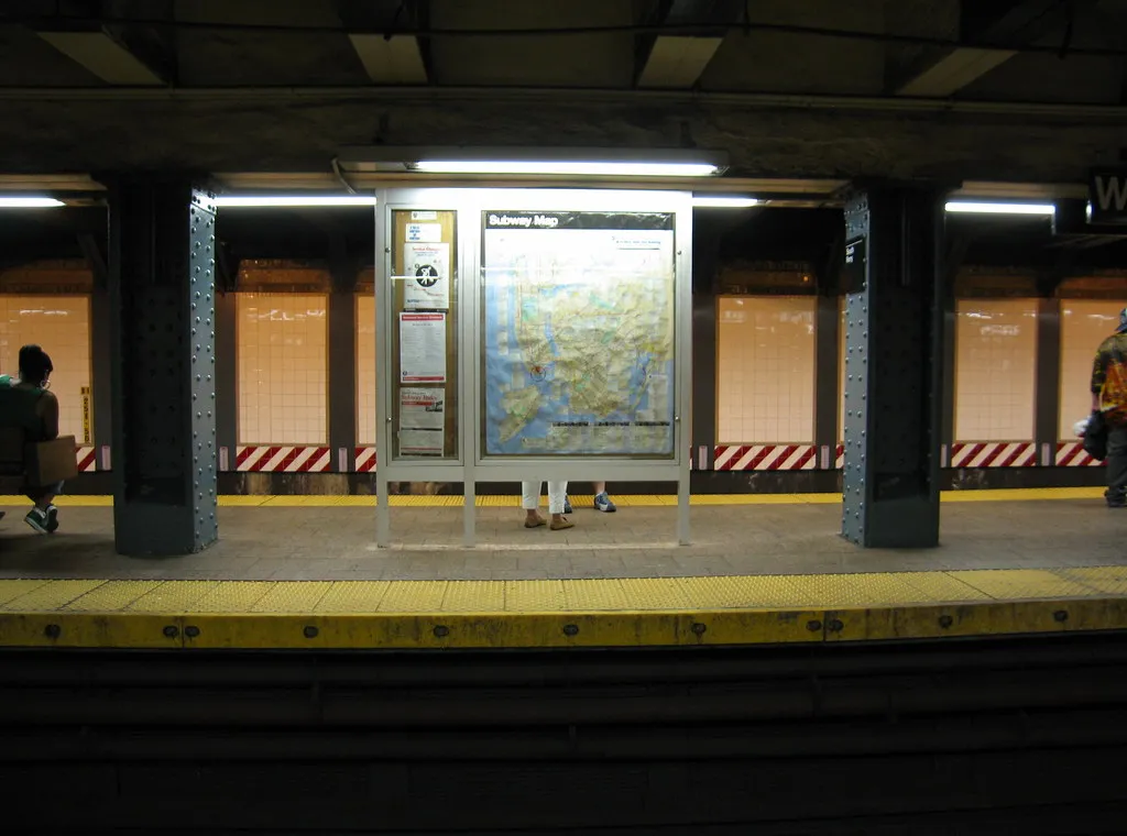
Today you can find London’s Underground map on posters, jumpers, tea towels and more. Alternative versions showing other cities, music genres, and even fictional characters connected like stations on a Tube-style network have also proven popular. That cultural reach stretches far beyond transit passengers.
Subway map posters make a bold visual statement in home offices, living rooms, and travel-themed spaces, with many designs including iconic typefaces, route lines, and geographic elements that highlight the structure and logic behind urban transit systems. People hang these things not out of nostalgia for their morning commute, but because the compositions genuinely hold their own on a wall.
The Science of Legibility and the Art of Simplification

Researchers studying cognitive complexity in metro maps found that the New York City subway map was the most complex, with the most total possible connections, followed by metros in Paris and Tokyo. The evolution of metro maps, from attempts at geographical accuracy to more schematic designs, has been necessary for comprehension, but consistent attempts to redesign maps demonstrate there could still be room for improvement.
The schematic diagram system proved so successful that it was adopted almost everywhere in the world – Sydney, Munich, Tokyo, New York, St. Petersburg, Osaka, Montreal – as early as 1939. One person sketching electrical diagrams in his spare time set the visual language for how billions of people find their way underground.
What Makes a Subway Map a True Work of Art
The maps that earn gallery space, inspire merchandise lines, and spark decades of public debate share something in common: they solve a genuinely hard problem with apparent ease. A great subway map makes a vast, tangled network feel logical and almost beautiful. It earns trust at a glance.
There are all sorts of maps done in the style of classic transit diagrams, from playful depictions of cities to visual inventories of cultural knowledge listed in books like Mark Ovenden’s “Transit Maps of the World.” The appetite for these objects says something real about how we connect with cities.
The Takeaway

What these six cities share is a recognition, often arrived at accidentally, that clarity itself can be a form of beauty. The NYC subway map stands as an enduring example of how design history can inform and elevate modern solutions, offering an inspiring lesson on the balance between aesthetic appeal and functional utility. That tension – between the useful and the lovely – is precisely what keeps people returning to these maps long after they’ve reached their stop.
A subway map that becomes art doesn’t set out to. It just solves its problem so well, so honestly, and with enough visual personality that the rest follows naturally. That’s worth a second look, even when the train has already left the station.
AI Disclaimer: This article was created with the assistance of AI tools and reviewed by a human editor.