
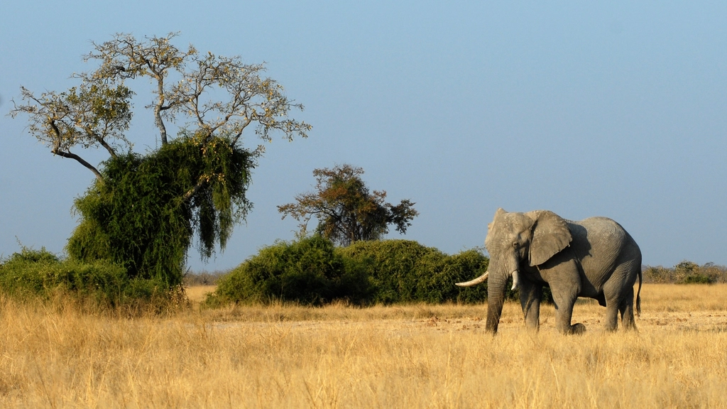

Most people have spent their lives looking at a map of Africa that is simply wrong. Not wrong in a minor, technical sense, but wrong in a way that has quietly shaped how an entire continent is understood, valued, and imagined. The land stretching from the Mediterranean coast to the Cape of Good Hope is, in real terms, so large it defies easy comparison.
What follows is a closer look at just how immense Africa truly is, why our maps have hidden that truth for centuries, and what that distortion has meant for one of the world’s most remarkable and complex places.
The Raw Numbers That Stop You Cold
Africa is a giant among the world’s continents at about 30.3 million square kilometres, or 11.7 million square miles. To put that in perspective, consider the three largest economies on the planet sitting side by side. Africa easily contains the contiguous United States, at roughly 8.1 million square kilometres, and China, at roughly 9.6 million square kilometres, with room to spare. Add India’s approximately 3.3 million square kilometres and we’re still not close to filling the continent’s footprint.
It takes a total of 30 countries together to equal Africa’s total area, underscoring how massive the continent is in absolute terms. These are verified figures from the UN Statistics Division, not estimates or approximations. The scale is simply hard to absorb all at once.
The Mercator Lie That Lasted 450 Years
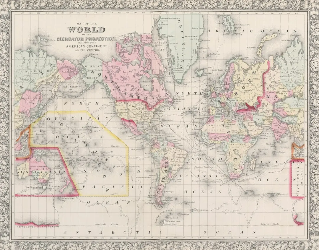
The Mercator map was developed in 1569 by Gerardus Mercator, a Flemish cartographer. The map allowed explorers to plot their journey in a straight line without having to adjust their compasses. It was genuinely brilliant for its original purpose. The problem is what it did to perceived size.
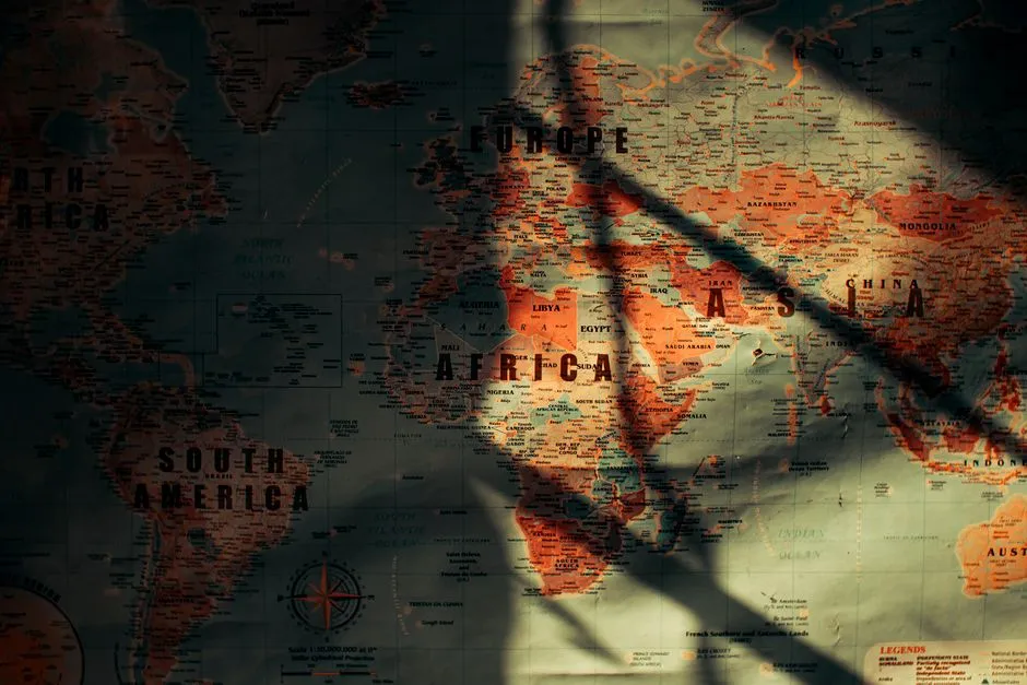
Designed to help European navigators at sea, the map distorted landmasses by enlarging regions near the poles, such as North America and Greenland, while shrinking Africa and South America. The consequence, centuries later, is a globally distributed misunderstanding. In the Mercator projection, countries near the north and south poles can be anywhere from two to fourteen times their true size.
Greenland vs. Africa: The Most Striking Comparison
The Mercator projection stretches the world ever more as you approach the poles, so Greenland balloons to look nearly the size of Africa, when Africa is actually about fourteen times larger. This single comparison has become the most referenced illustration of cartographic distortion in modern geography, and for good reason.
Africa is large enough to contain the US, China, India, and most of Europe, yet on a Mercator map it looks roughly the same size as Greenland, which is actually about fourteen times smaller than the continent. Once you see that, the conventional world map starts to feel less like a neutral tool and more like a particular point of view.
The UN Just Voted to Fix It
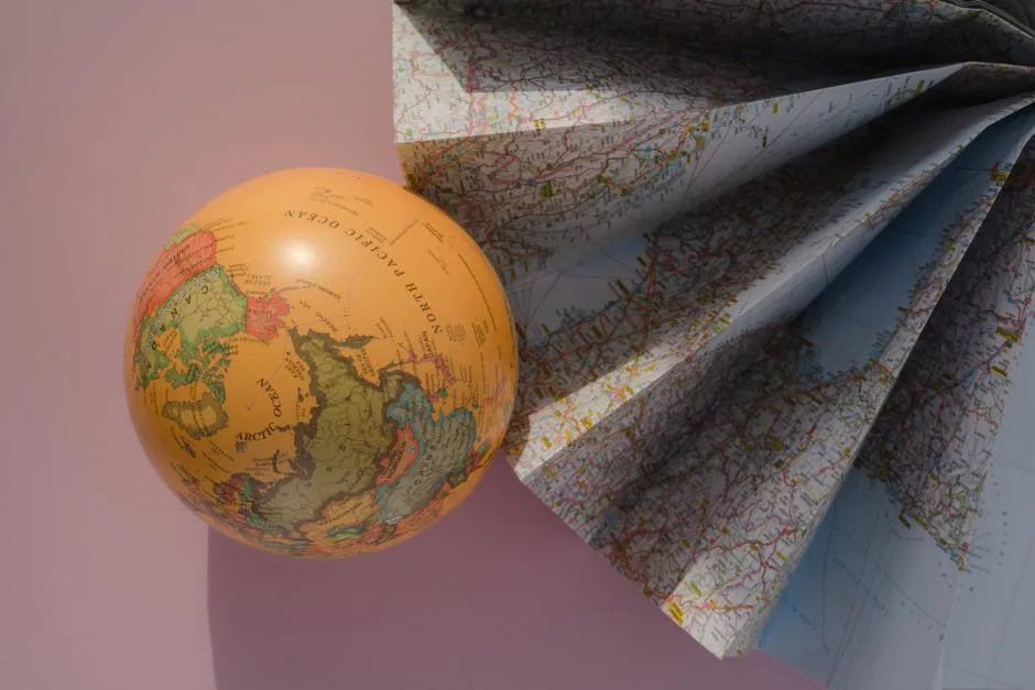
In September 2026, this centuries-old distortion became a matter of formal international debate. On 4 September 2026, the UN General Assembly passed the ‘Correct the Map’ resolution, endorsing the Equal Earth projection over Mercator, with 164 votes in favour, 6 abstentions, and a single vote against – the United States.
The resolution does not ban the Mercator projection or impose a replacement. Instead, it encourages governments, schools, international organizations, and technology companies to use the Equal Earth projection and other equal-area maps when relative size matters, and to teach the limitations of any flat map in representing a spherical planet. It is a cultural shift as much as a cartographic one.
The Equal Earth Projection and Why It Matters
The Equal Earth projection was developed in 2018 by cartographers Bojan Šavrič, Tom Patterson, and Bernhard Jenny, and it preserves the true proportions of the world’s landmasses. On this map, Africa appears as it actually is – dominant, expansive, and central. Patterson’s map projection is what’s known as an equal-area map. It shows the true relative sizes of countries and continents, though their shapes are somewhat distorted. The Mercator map is conformal, which means shapes are preserved, but actual sizes are distorted.
The resolution describes correcting such distortions as an act of “cognitive justice and memorial reparation” and points to Equal Earth, developed in 2018, as a projection that more accurately represents relative size. These are strong words for a conversation about maps, but the underlying point is serious.
Africa’s Second Dimension: A Continent That Covers the World
Africa covers about 20.4 percent of the Earth’s total land area, spanning roughly 30.3 million square kilometres. That is a fifth of all the dry land on Earth. The African continent has a land area of 30.37 million square kilometres, enough to fit in the US, China, India, Japan, Mexico, and many European nations, combined.
At 11.7 million square miles, Africa is the world’s second-largest continent after Asia. The distinction matters because size, in geography, carries real implications for climate diversity, biodiversity, resource distribution, and the sheer complexity of governance across the landmass.
The People Who Call This Vast Land Home
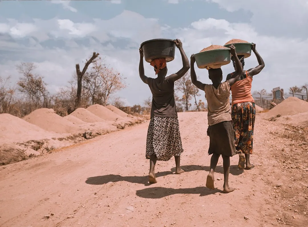
The current population of Africa is approximately 1.59 billion as of September 2026, based on interpolation of the latest United Nations data. Africa has been the fastest-growing continent by population since 1972. The continent’s annual population growth rate stands at 2.26 percent in 2025, and is projected to remain above 2 percent until 2032.
According to UN estimates, the population of Africa may reach nearly 2.5 billion by 2050, about 26 percent of the world’s total, and 3.8 billion by 2100, about 37 percent of the world’s total. That is a demographic trajectory unlike anything happening elsewhere on the planet right now.
54 Countries, Thousands of Languages, One Continent
Africa is home to 54 recognized sovereign states and countries, 9 territories, and 2 de facto independent states with very little international recognition. That political complexity alone gives a sense of how impossible it is to speak of Africa as a single place in any meaningful cultural or economic sense.
As of 2026, Nigeria counted over 242.4 million individuals, whereas Ethiopia, which ranked second, had around 138.9 million inhabitants. Egypt registered the largest population in North Africa, reaching nearly 120.1 million people. Three countries, three very different histories, climates, and cultures – all sitting within a continent large enough to hold the world’s biggest economies.
Why the Size Distortion Has Real Consequences
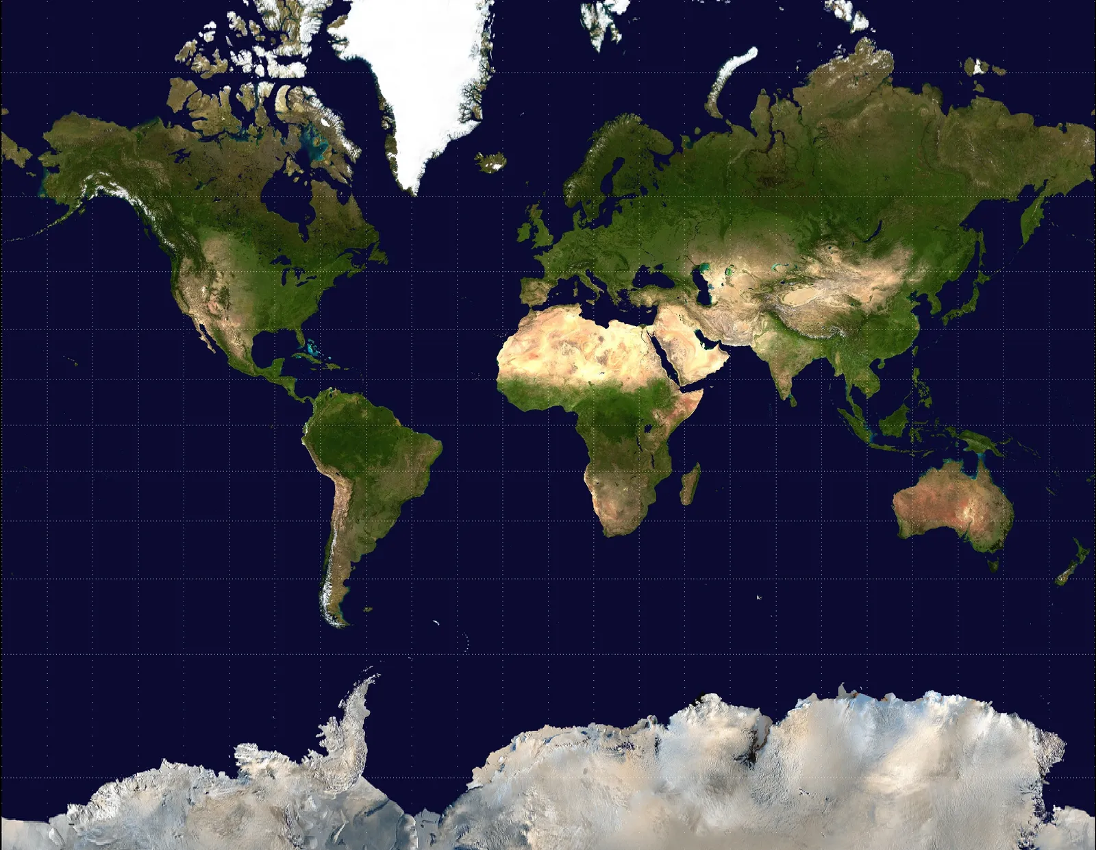
The Mercator projection’s distortions have contributed to the “symbolic minimization” of Africa and perpetuated an unbalanced view of the world, according to the UN resolution. This is not just academic language. When a continent appears smaller than it is, decade after decade, in classrooms and news broadcasts and digital maps, it subtly influences assumptions about its importance, complexity, and weight in the world.
A change in map projections, for the African Union, is about more than correcting a technical flaw. It is also a chance to influence how current and future map users view, talk about, and value Africa. Geography taught honestly changes the questions people think to ask.
Africa’s Youth, Its Growth, and What Comes Next
With so many births, Africa is also the youngest continent in the world. The population of Africa has increased by 595 percent since 1950, which is more than double the second-highest figure, South America’s 294 percent. That kind of generational momentum, at this scale, has no modern parallel.
Africa will add 35 million people in 2025 alone, a number close to the entire population of Ghana. The continent’s physical size created the conditions for extraordinary ecological and cultural diversity. Its demographic trajectory is building the conditions for an equally extraordinary future – one that the rest of the world is only beginning to fully reckon with.
The Takeaway
Geography is never just geography. The way a place appears on a map shapes how it is taught, discussed, and ultimately treated. Africa’s true size, confirmed by UN data and now formally acknowledged by a landmark General Assembly resolution in September 2026, is not a minor correction. It is a fundamental reorientation of how one of the world’s great landmasses deserves to be understood.
A continent that holds the United States, China, and India simultaneously – with space left over for much of Europe – is not a peripheral place. It is, by every geographic measure, one of the most consequential pieces of land on Earth. The maps are finally beginning to say so.
AI Disclaimer: This article was created with the assistance of AI tools and reviewed by a human editor.