
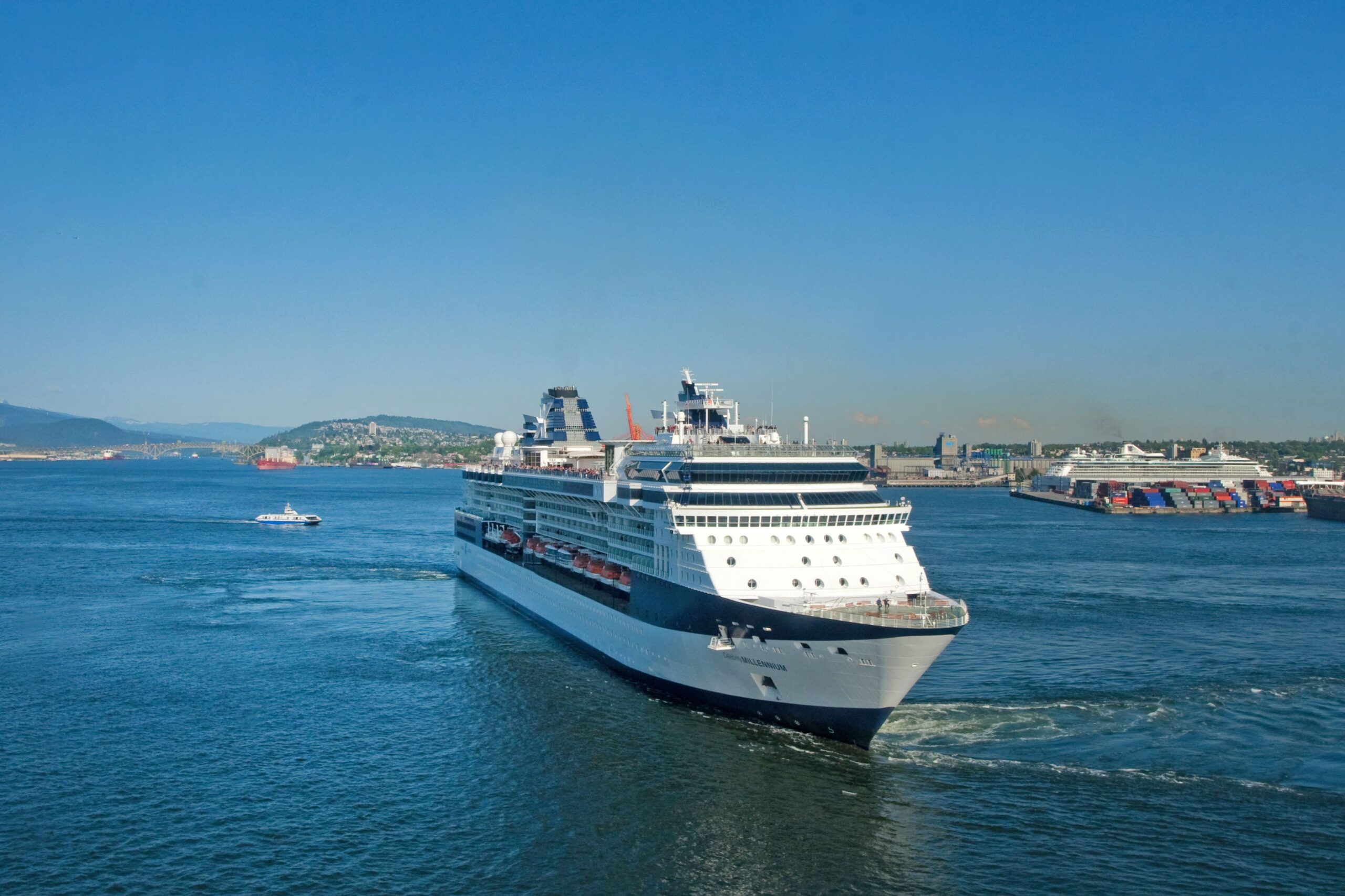

Spend enough time watching ships ease into port and you start to notice something interesting. Before you read a name on the hull, you can often tell which company owns a vessel just by the shape and color sitting atop it. That tower of metal near the stern isn’t just an industrial afterthought. It’s one of the most studied and, in some cases, fiercely protected design choices in the cruise industry.
Funnels have been part of ocean travel since the earliest steamship era, but what they represent today goes well beyond simple engineering. Color, shape, logo, and even the number of stacks have been used for well over a century to signal identity, status, and belonging on the open sea. The story of why they look so wildly different from line to line is part engineering, part branding, and part genuine maritime heritage.
The Original Job: Moving Smoke Away From People

The funnel was first introduced in the steamship days, when oceangoing ships made the transition from sail power to coal-fired engines. Funnels were originally designed as chimneys, used to expel smoke and fumes from belowdecks, and directed skywards to keep the outflow from interfering with crew or passengers.
The primary purpose of a ship’s funnel is to lift the exhaust gases clear of the deck, in order not to foul the ship’s structure or decks, and to avoid impairing the ability of the crew to carry out their duties. That basic job description hasn’t changed dramatically, even as the ships themselves have become floating cities.
Today’s ships are much cleaner than steamships of old, running on gas that produces less exhaust. Still, cruise ship funnels are needed, and the amount and size of the funnels directly relates to the outflow of exhaust produced by the ship’s engines.
The Myth of More Funnels Meaning More Power
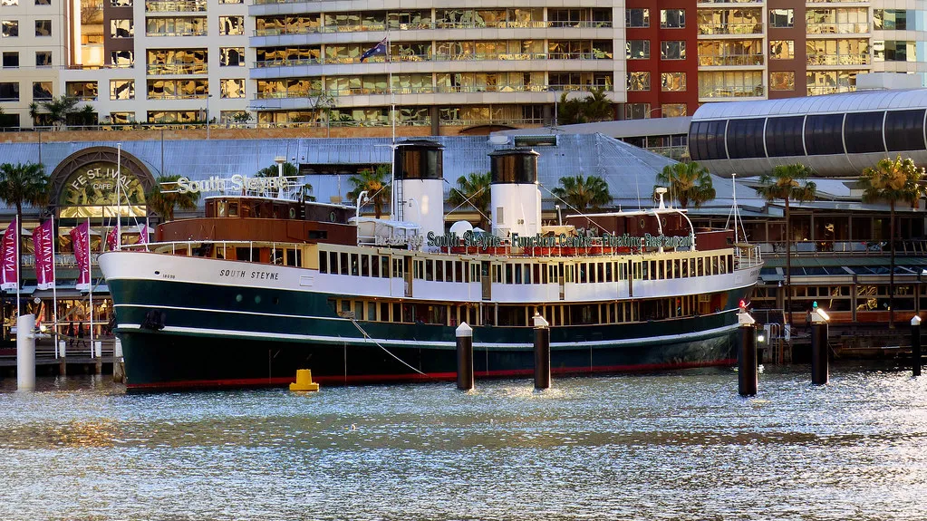
In the early days of transatlantic cruising and shipping, there was a widely held belief that the number of funnels a ship had related to how fast or powerful it was. Ships with four stacks were seen as the pinnacle of maritime engineering, whether or not all those funnels were actually connected to working boilers.
Alongside working funnels, some ships, including the ill-fated RMS Titanic and RMS Lusitania, had false funnels that were designed more for image than practicality. It was a clever bit of theater. Passengers booking passage felt reassured by the sight of a four-funneled ship, even if one of those stacks was essentially decorative.
Some designers had tried to streamline funnels, especially in the 1930s, but they often found soot on the deck, and funnels got taller as a result. By the 1950s, designers and lines considered funnels passé and explored pipes or other ways to reduce them. The aesthetic ambition, however, never fully disappeared.
When Funnels Became Billboards
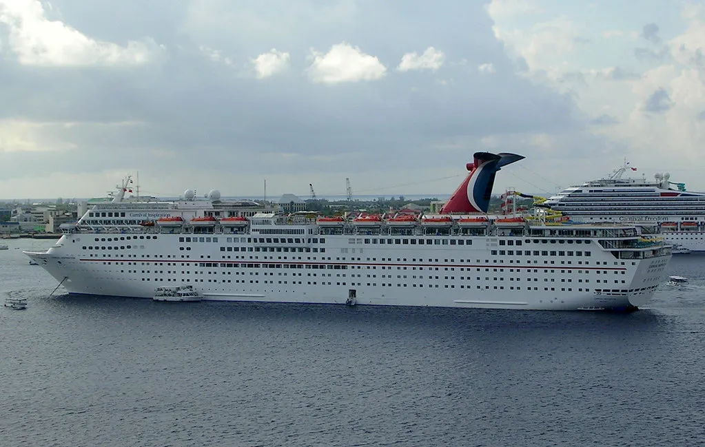
In an era when ship hulls were uniformly painted black and superstructures were white, the funnel was one of the few parts of the ship that a company could use to clearly differentiate its ships from those of its competitors. With so little else to work with visually, funnel color became the primary language of maritime identity.
Some companies became so closely associated with their funnel colors that their nickname became a de facto company name. Sometimes the shape of the funnel is used as a distinguishing feature rather than just the color. A sailor or port worker could identify an incoming vessel from miles away simply by glancing at the stack.
This visual language became deeply ingrained. Even as ships grew larger and more complex, cruise lines understood that the funnel offered a uniquely visible canvas. Change it, and you risk confusing loyal passengers. Keep it, and it becomes one of the most recognizable shapes in travel.
Carnival’s Patented Whale Tail: A Design That Changed Everything
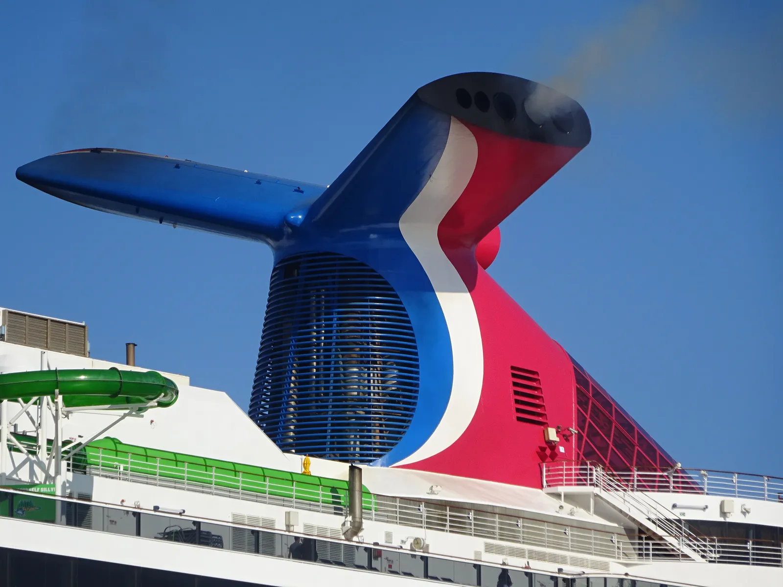
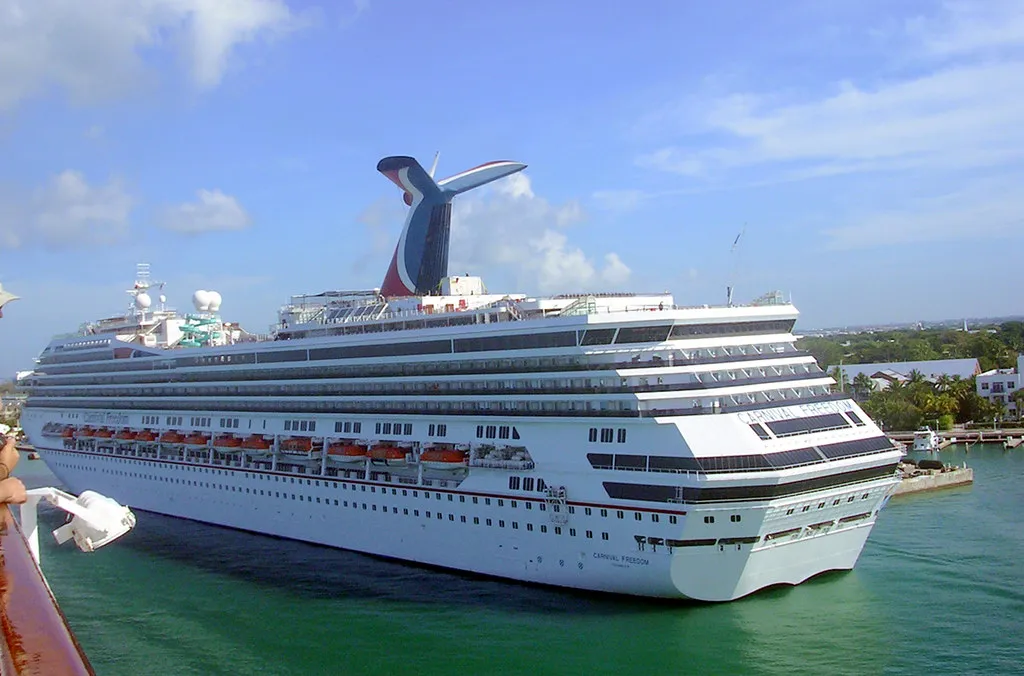
The Tropicale was launched in 1981 and was the first cruise ship custom-built for the company, introducing Carnival’s characteristic winged funnel, designed by Joe Farcus. It was a bold departure from convention, and it immediately set Carnival apart from every other line on the water.
The split-wing design directs engine emissions out to either side of the ship, instead of simply up into the air like a traditional funnel. Carnival actually holds the patent on its funnel design to make sure that no other cruise line can copy it. That legal protection has held firm, and the whale tail remains an exclusive Carnival signature.
The shape of the wings on the funnels increases the uplift on the funnel’s exhaust. The idea behind the design is that both sides of the funnel would lead exhaust fumes into the ship’s slipstream, where they would be carried away far from passengers on the decks below. In reality, the airflow benefits are minimal compared to the design benefits. Carnival Cruise Line primarily uses the funnel as company branding.
Cunard’s Red and Black: A Legacy That Predates Modern Cruising
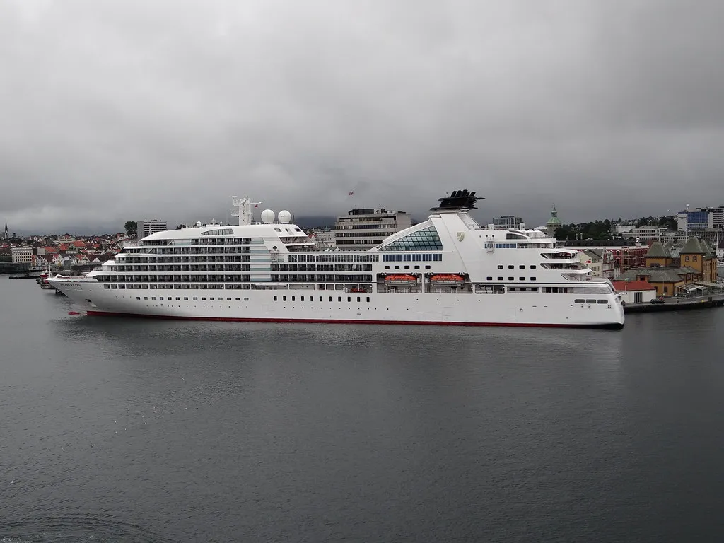
Cunard ships are instantly recognizable by their distinctive red funnels and black hulls. This color scheme has been an integral part of the cruise line since the very earliest days of Cunard. Few design choices in any industry carry that kind of unbroken continuity across nearly two centuries.
While many cruise ship fleets have mainly white ships, the dramatic Cunard black hulls and red and black funnels stand out and are instantly recognizable among the more standard cruise decor in any port. When a Cunard ship enters harbor, there’s no mistaking whose flag it sails under.
This consistency is partly strategic and partly cultural. Cunard’s identity is built around transatlantic heritage, and the funnel is one of the most potent symbols of that story. Changing it, even slightly, would feel like rewriting history.
Disney: Where Nostalgia and Hidden Surprises Meet
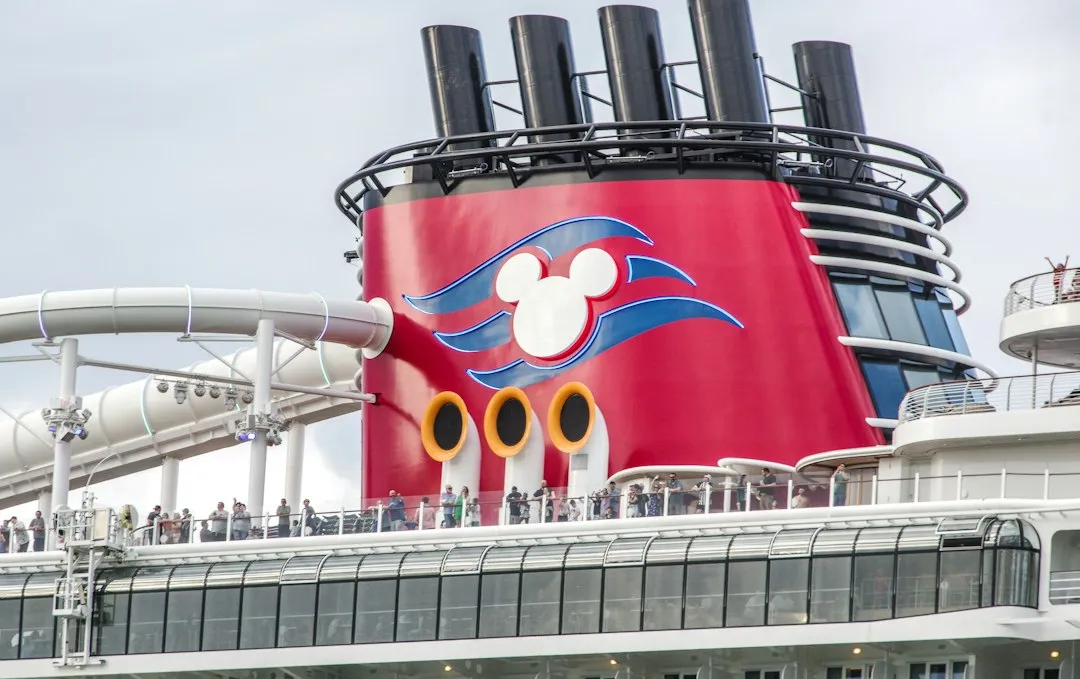
Disney Cruise Line recalls steamships of old, with bright red funnels punctuated by a familiar Mouse-eared silhouette, and one of the funnels is a fake, housing youth clubs instead. That nod to classic ocean liner aesthetics is entirely deliberate, reflecting the company’s commitment to storytelling through design.
Disney Cruise Line’s forward and aft funnels, with their blazing red color, are classic features on the top decks of its ships. However, the funnels atop Disney Treasure are designed not only for appearance. The forward funnel is part of the ship’s AquaMouse water coaster thrill ride, where powerful jets propel two-person vehicles through 760 feet of winding tubes.
It’s a smart use of space that manages to honor tradition while turning a structural feature into an attraction. The funnel becomes part of the guest experience itself, which is very much in keeping with how Disney approaches everything it builds.
Celebrity, Royal Caribbean, and the Logo-as-Identity Approach
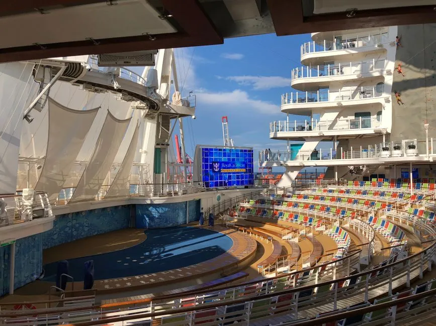
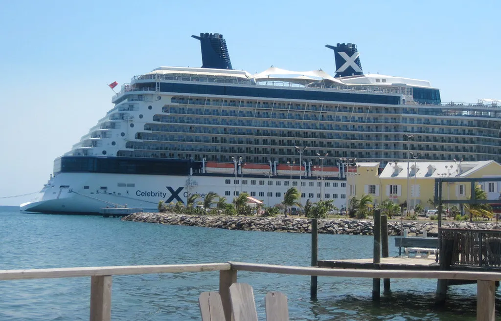
Celebrity’s funnels are marked by the brand’s white X logo, while Royal Caribbean’s carry the line’s crown-and-anchor logo affixed to the side. Both approaches lean on iconography rather than color alone, treating the funnel as a physical expression of a broader visual brand system.
Since 1969, the Crown and Anchor has confidently represented the strength of Royal Caribbean’s brand. In recent years the company has taken intentional steps to bring standalone visibility to the Crown and Anchor, increasing its size on the side of new ships and showcasing it in advertising and merchandise.
The result is a funnel that functions almost like a corporate logo hoisted high above the waterline. It’s visible from shore, from other vessels, and from dockside cameras, making every ship a moving advertisement for the brand that owns it.
Costa and MSC: European Lines, European Sensibilities
Costa cruise ships are recognizable by their bright yellow funnels, while Norwegian and Princess have their logos on their funnels. Costa’s bold yellow stands apart visually and echoes a Mediterranean confidence in color that feels consistent with the line’s Italian roots.
In 1995, StarLauro Cruises was rebranded as MSC Cruises, with the livery changed from the blue funnel star logo to a white funnel with the MSC logo. That rebranding moment illustrates how much a funnel redesign can signal a company’s reinvention. MSC has since grown into one of the world’s largest cruise operators, and the clean white funnel became part of a sleek, modern identity.
Both Costa and MSC reflect a European tradition of using color and form to express corporate character. Their funnels feel less nostalgic than Cunard’s and less theatrical than Carnival’s, opting instead for clarity and visual confidence suited to the Mediterranean market they largely dominate.
False Funnels: When Engineering Takes a Back Seat to Theater
The false funnels did have more uses than simply aiding aesthetics. A stoker who survived the sinking of the Titanic escaped the boiler room by ascending the false funnel, the aft funnel of Normandie housed the passengers’ dog kennels, and Disney Cruise Line’s Disney Magic’s forward funnel plays host to a teens-only club.
That trend continues today, when cruise lines are keeping the look of the larger funnel and personalizing these ship funnels to match their brands. The false funnel, repurposed as amenity space, is one of the more creative ways modern shipbuilders have found to justify a large structure that might otherwise feel redundant on a gas-powered vessel.
There’s something quietly clever about turning a Victorian-era holdover into a waterslide housing or a teen lounge. It’s proof that the funnel’s role has never been purely mechanical. It has always been shaped by what people expect to see on a great ship.
Modern Engineering and Environmental Pressures Are Quietly Reshaping the Funnel
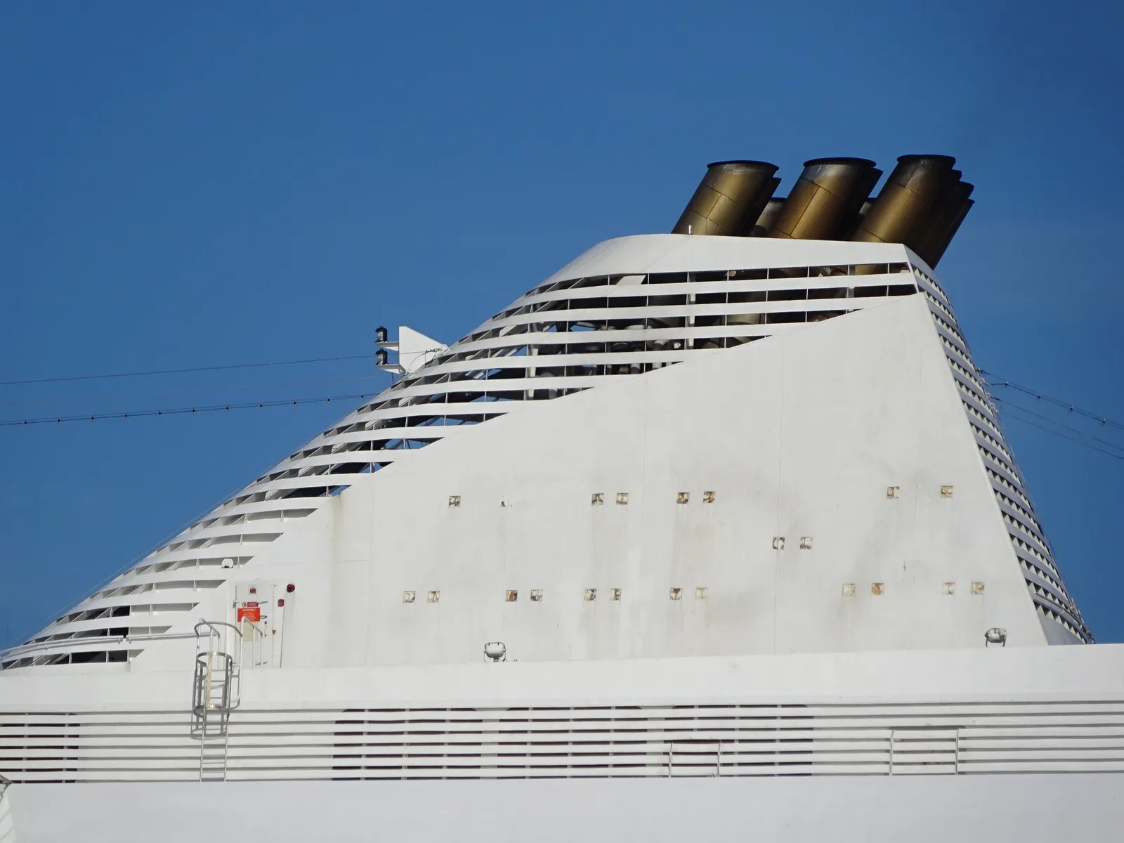
With the advent of stricter environmental regulations, the role of the funnel expanded to accommodate exhaust gas cleaning and precise ventilation requirements, while designs shifted to reduce back pressure and improve aerodynamics. The ship funnel today reflects a continuum: heritage aesthetics fused with advanced engineering to meet modern performance and environmental standards.
Carnival Cruise Line had a new funnel fitted on a ship during her September-October 2026 dry docking at the Chantier Naval de Marseille shipyard in France, a reminder that even the most iconic funnel designs require physical maintenance and ongoing adaptation as ships age and regulations evolve.
Carnival Cruise Line has preserved and even celebrated its heritage with the funnels while other cruise lines appear to hide them, surrounded by the amusements on deck. That tension between tradition and transformation is likely to define funnel design for the next generation of vessels, where LNG propulsion and emissions-scrubbing technology will demand new engineering solutions without necessarily erasing the visual signatures that passengers have come to recognize.
The Takeaway
The funnel is one of the oldest features on any ocean-going vessel, and yet it remains one of the most expressive. What began as a practical chimney for coal smoke became a symbol of speed, then status, then corporate identity. Today it occupies a space somewhere between engineering necessity and brand asset, shaped by history, legal patents, environmental rules, and the simple human desire to recognize something familiar on the horizon.
Every time a cruise ship enters a new port, its funnel tells a story before anyone steps off the gangway. The red whale tail, the black-and-red Cunard stack, the twin Disney towers, the Costa yellow. These aren’t accidents of design. They’re deliberate choices made over decades, sometimes over a century, to say something specific about who built the ship and who it’s for. That kind of identity is worth preserving, and the cruise industry, for all its appetite for newness, seems to understand that.
AI Disclaimer: This article was created with the assistance of AI tools and reviewed by a human editor.