
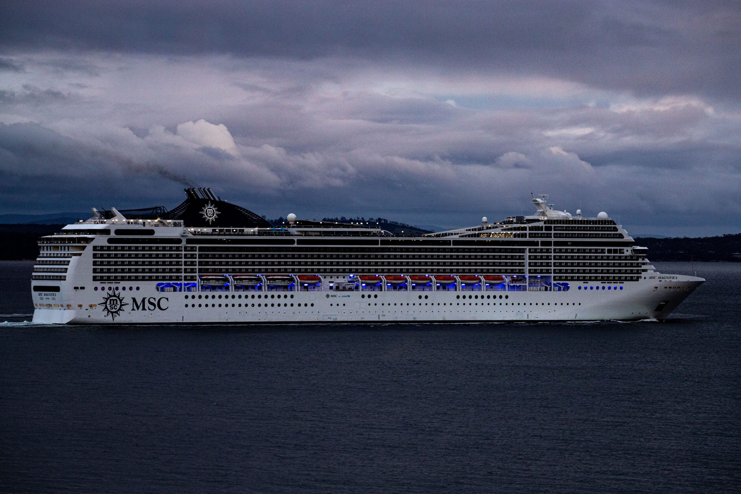

Look out at any major port in the world, and the ships lined up along the docks will tell you something interesting. The cargo vessels come in reds and grays. Military ships fade into a cautious, flat grey. The cruise ships? Almost always white, gleaming under the sun like they were designed to catch your eye from miles away.
It turns out there’s no single explanation. The reasons stack up, layer by layer, covering physics, history, psychology, safety, and branding. Each one makes sense on its own. Together, they explain why white has become the unofficial uniform of passenger ships around the world.
It Started with Coal and Soot

The story begins with the steam-powered ocean liners of the 19th and early 20th centuries. Ships with the prefix “SS,” meaning steamship, burned enormous amounts of coal to fire their boilers and generate steam. That black, greasy, sooty fuel had to be loaded through doors and hatches cut into the hull near the waterline.
It’s easy to imagine how clouds of coal dust during loading would ruin the appearance of even the most beautiful hull, so companies usually opted for dark colors to keep vessels looking neat and to save time cleaning the hulls in port.
Light colors only became the norm after ships converted to oil. One good example of this transition was Cunard’s RMS Mauretania, which was modernized to burn oil instead of coal after World War I, and her black hull was repainted white. The shift from black to white wasn’t a fashion decision, it was a practical consequence of cleaner fuel.
The Royal Navy’s Quiet Influence

Cruise ships have been associated with white since around the 18th century. That’s when the British Royal Navy began painting all of its ships white, so they would be more visible when at sea. Because of that influence, passenger ships and cargo vessels also began being painted white.
The reach of maritime tradition is often underestimated. When the Royal Navy set a visual standard, commercial operators followed, partly for practical reasons and partly because the association with naval authority lent passenger lines a sense of prestige and order. White became the color of exotic vacations and clearly distinguished the ships used for fun from those used for transportation.
White Reflects Heat, Literally
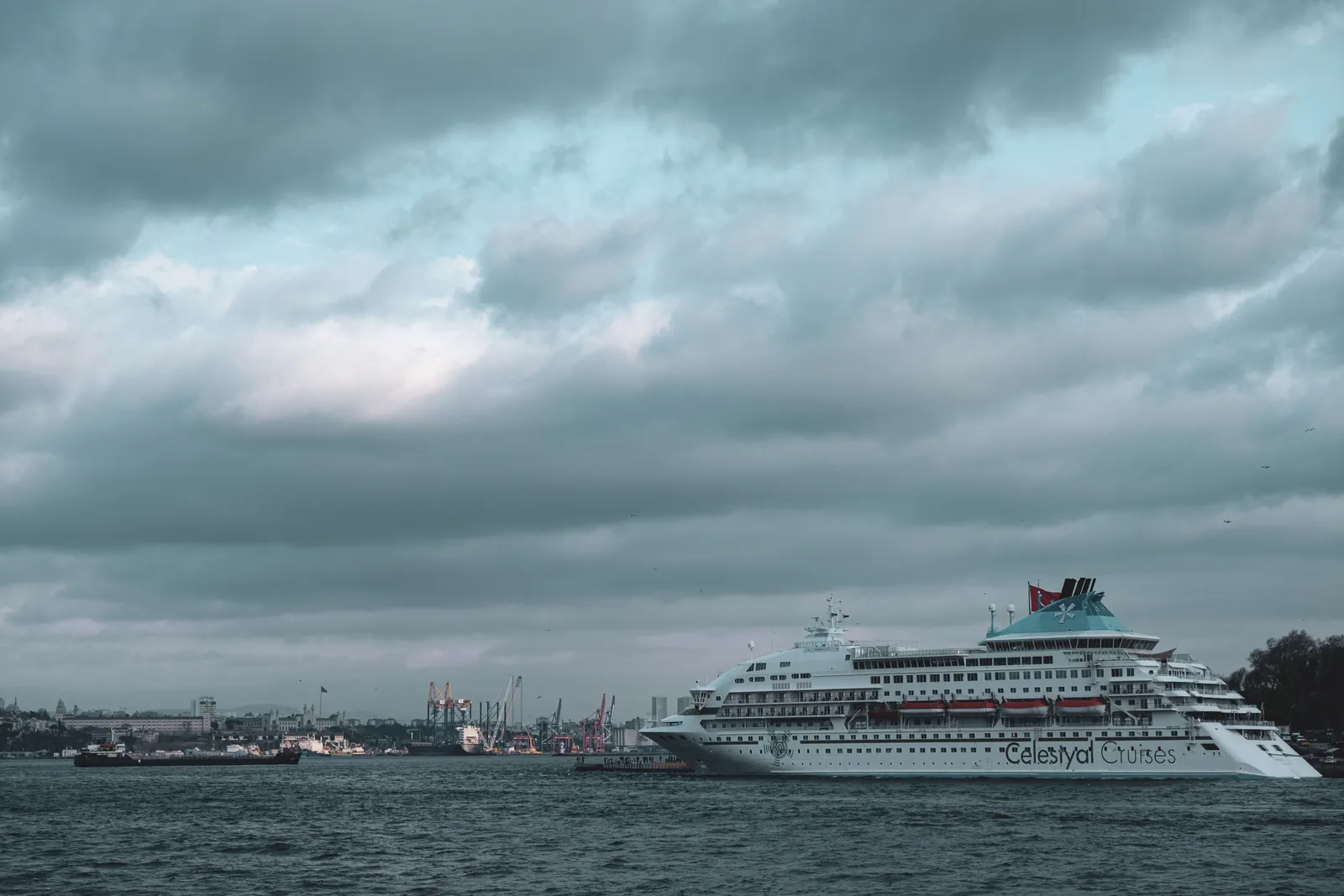
Since white reflects all the wavelengths in the visible spectrum of light, it absorbs less heat and stays cooler. This is especially important for cruise ships and luxury yachts that often sail in warmer climates, allowing them to rely less on air conditioning, which requires lots of energy to cool down hundreds of cabins.
Being the best reflector and worst absorber in the color spectrum, white-colored exteriors save the ship from getting heated up, reducing the burden on air conditioning systems. That matters more than it might sound. A modern large cruise ship can have well over a thousand cabins, and cooling them all in the Caribbean heat is an enormous energy task.
According to research cited by engineers involved in paint development, most white paints on the market are capable of reflecting roughly 80 to 90 percent of sunlight. That’s a substantial figure when you’re talking about a vessel the size of a floating city sitting under direct tropical sun for weeks at a time.
Energy Savings That Actually Add Up
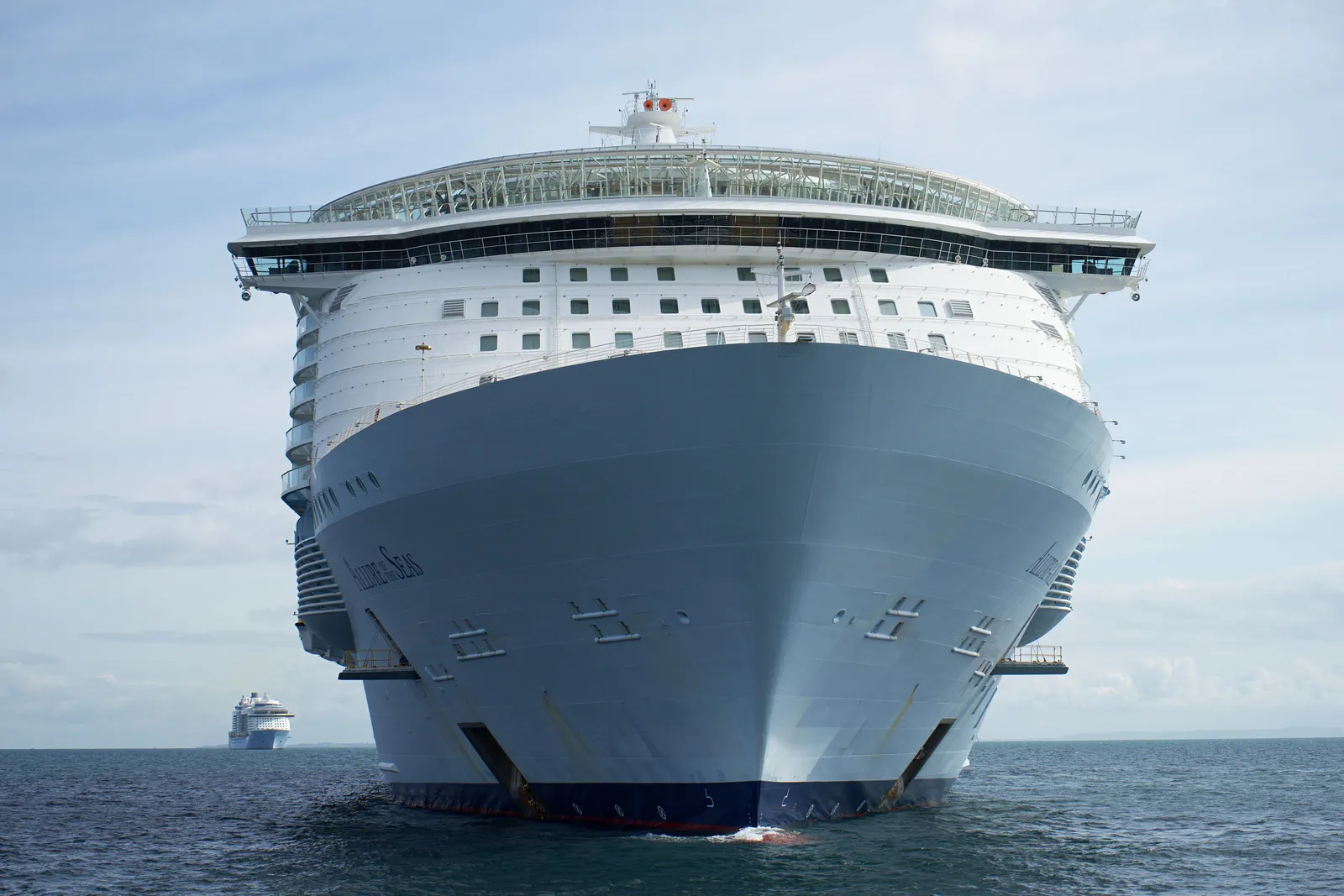
White paint reflects sunlight, so the ship doesn’t absorb excess heat. That, in turn, helps it be more energy efficient and means not having to blast the air conditioning so hard when traveling through the Caribbean in spring and summer.
White cruise ships became popular because designers thought it would keep the ship cooler in warmer climates, as cruise ships and yachts typically sail in tropical, warm places. The white color also allows air conditioning systems to work less, thus saving energy. For cruise lines operating dozens of ships on continuous rotations, those cumulative savings become financially significant over time.
Visibility and Collision Safety
When you’re in the middle of an ocean with just dark blue water and light blue skies, a white ship in the distance is going to be easy to see, because it reflects sunlight. That’s even the case at night, when the ship is lit up with outdoor lighting. A ship that’s easy to see is a ship that’s easier to avoid a collision with.
White also helps the cruise ship stand out against the blue backdrop of the ocean and sky, offering a spectacle to passing observers and would-be customers. That visibility has a dual purpose: safety on the water and marketing value from the shore. It’s a rare case where the same quality serves two entirely different goals.
Compare that to naval warships. It’s for precisely the opposite reason that navy warships are typically painted gray or muted blue: to blend into the sea and reduce their visibility. The contrast between the two approaches makes the logic of white even clearer.
Spotting Rust and Damage Early

If you have a white ship, it’s easy to see when rust or cracks start to happen, showing up as brownish-orange patches against that white background. If the hull were brown or dark, those areas would be much harder to spot.
On a vessel that operates year-round in saltwater, early detection of corrosion isn’t just about appearances. It’s a structural and safety matter. White paint essentially functions as a diagnostic tool, making the hull’s condition legible to maintenance crews at a glance. Beyond dodging heat, white also makes ship maintenance easier and adds a layer of safety.
The Psychology of a White Ship
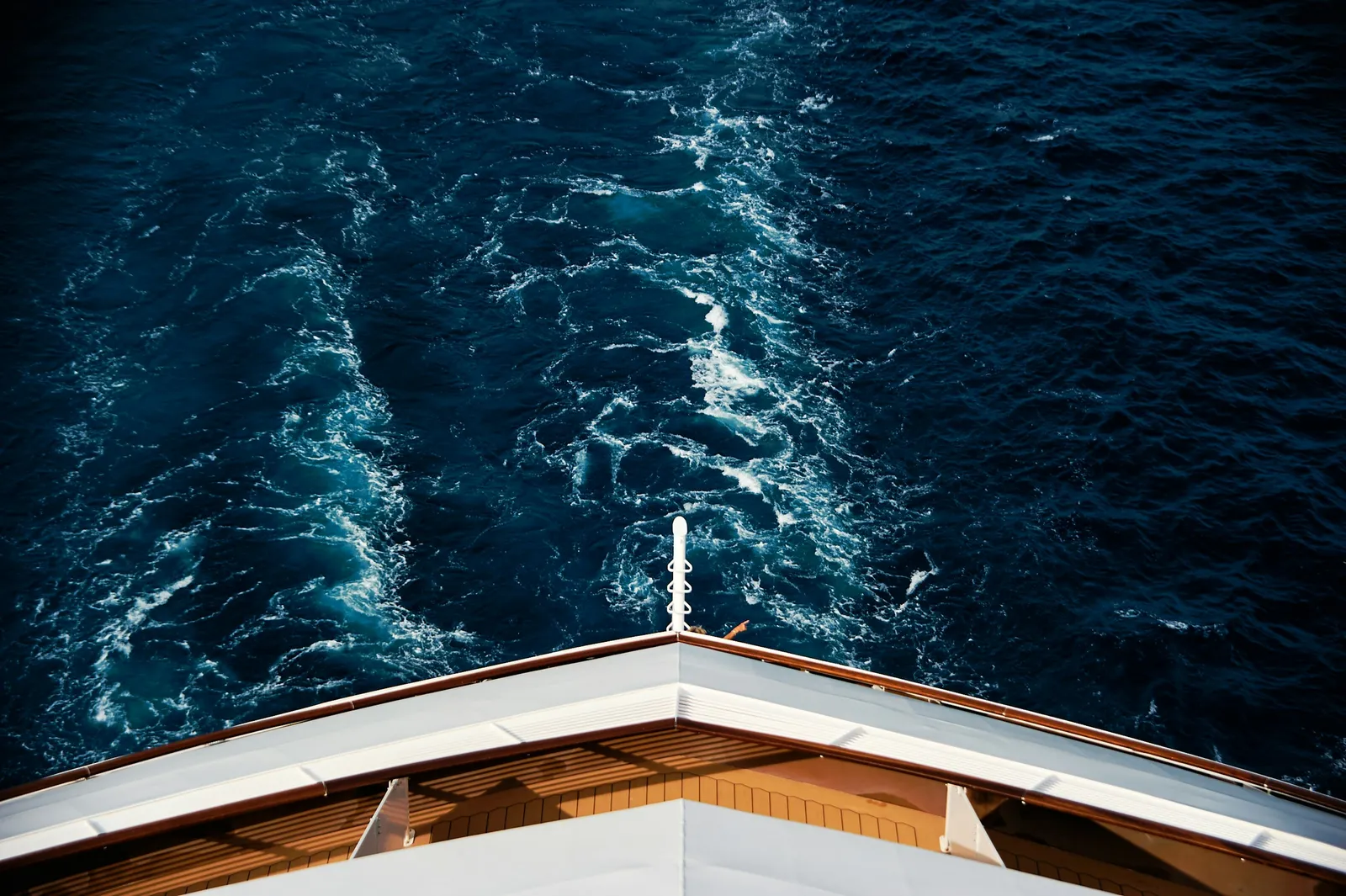
White paint brings a clean and tidy look to the ship, shining against the blue background of the ocean. Psychologists have suggested that white is related to invoking a strong holiday spirit among passengers, giving them a sense of occasion. That psychological dimension isn’t trivial. The moment a passenger sees that gleaming white hull, something shifts in their mental state.
The color white is often linked with luxury and status. A white paint job looks clean and shiny, and it stands out from the background of the sea and sky. For cruise lines selling the promise of an exceptional escape, the visual cue of white reinforces what the brochure already says. It signals something elevated before a passenger ever steps on board.
The Dark Hull Tradition Lives On (Partially)
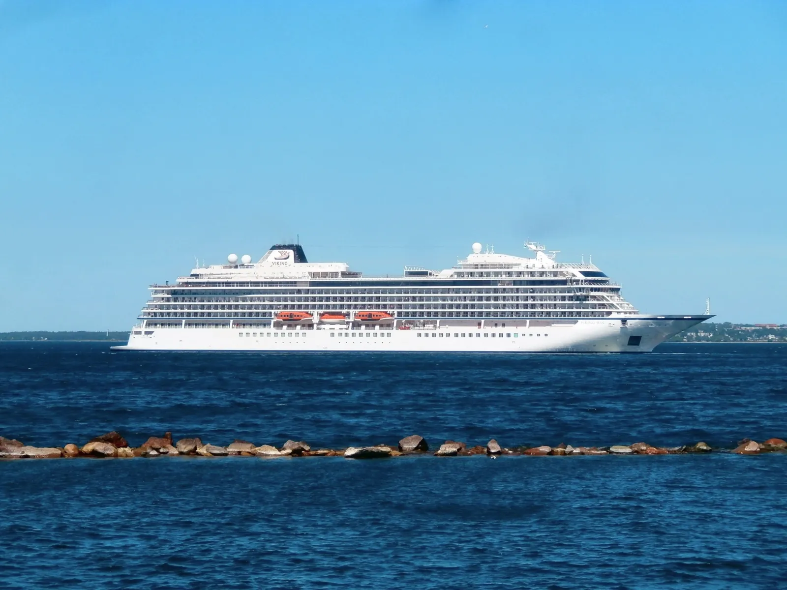
Not every part of a cruise ship is white. While the upper parts of cruise ships are almost always white, the lower hull often tells a different story. Many ships feature a navy or red coating on the bottom of the hull, a tradition rooted in both practicality and maritime heritage. These darker colors help mask rust and other discolorations that occur where the ship meets the water.
Even cruise lines such as Celebrity, Disney, and Holland America have decided to keep a hull a dark color, a tradition that went back to the days of hiding coal dust, while the upper parts of their respective ships are still overwhelmingly white. It’s a practical compromise that honors both history and functionality.
Branding Is Pushing Back Against White
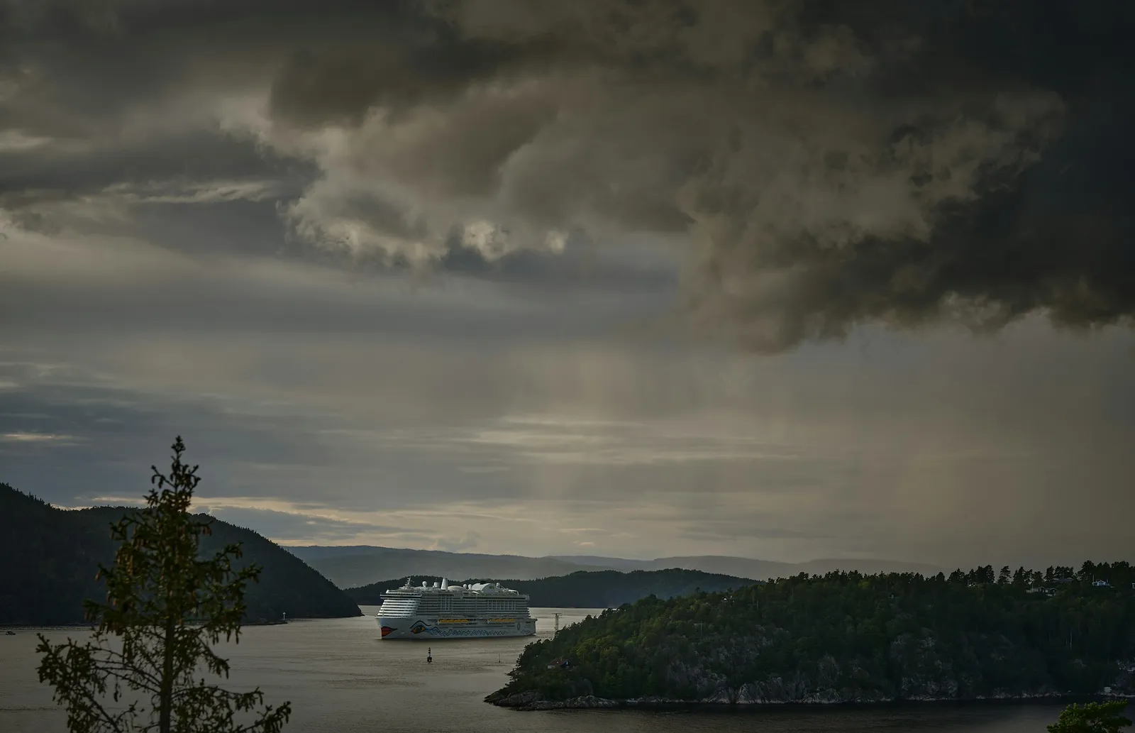
The dominance of white is real, but it’s not absolute. Both ships and planes alike are seeing companies break these rules by opting for more inventive color palettes, hoping to reinforce their brand identity and stand out from the crowd. The shift is gradual, but it’s noticeable.
Over time, cruise lines are distinguishing their ships with a greater variety of colors. Norwegian Cruise Line started the idea of colorful ships nearly 20 years ago, and other cruise lines today, including Royal Caribbean International and Virgin Voyages, are experimenting with blue and gray colors.
The most recent addition to the cruise industry, Virgin Voyages’ Scarlet Lady, is entirely grey, except for the red stern and the picture of a mermaid on both sides of the hull. That’s a deliberate choice to look different, and it signals how branding ambition is beginning to outweigh tradition for certain lines.
White as a Standard and a Cost-Control Tool
There’s also a more straightforward industrial logic at work. White is a standard color, widely available, and easier to apply consistently across an entire fleet. Even though cruise lines have to spend heavily when it comes to white paints and maintaining them with pinpoint accuracy, passengers seem to absolutely love them.
Standardization simplifies procurement, maintenance scheduling, and touch-up work between voyages. A fleet of ships all using the same white paint formula means spare supplies are interchangeable, and crews don’t need to manage multiple color inventories across different vessels. It’s the kind of quiet operational efficiency that rarely makes headlines but shapes decisions every day.
The Takeaway
White on a cruise ship isn’t one decision, it’s a dozen decisions that all arrived at the same answer. Physics, history, psychology, safety, maintenance, and marketing have each pulled in the same direction for well over a century. That’s a rare kind of consensus in a competitive industry.
The growing appetite for bolder hull colors among some newer lines is genuine, and it may slowly reshape the visual identity of cruising over the next decade. Still, the practical advantages of white, from heat reflection to early rust detection to simple visibility on the open ocean, aren’t going anywhere. The logic behind the color is too sound to abandon entirely, even for lines eager to look different.
AI Disclaimer: This article was created with the assistance of AI tools and reviewed by a human editor.