

There’s a moment almost every traveler experiences: you glance at the route map on your seat-back screen and the path to your destination looks strangely bent, arcing far north toward icy landmasses instead of cutting straight across the ocean. It doesn’t look efficient. It doesn’t look intentional. It looks like a mistake.
It isn’t a mistake at all. The curve you’re seeing is actually the most direct route possible on a round planet, displayed on a flat surface that can’t help but distort reality. Understanding why that happens changes how you see every map you’ll ever look at again.
The Earth Is Round, but Your Map Isn’t

A straight line on a two-dimensional map is not the same as a straight line on a three-dimensional globe. That single distinction explains almost everything. The world we navigate on paper or on screen is a flattened version of something that refuses to be flat, and every flattening involves tradeoffs.
The Earth is roughly spherical and the screen is flat, and there is no way to move one onto the other without distorting something. The projections used for most maps preserve angles at the cost of distance and area, which is why Greenland looks continental and why the genuinely shortest route between two distant points looks like a detour.
What the Mercator Projection Actually Does
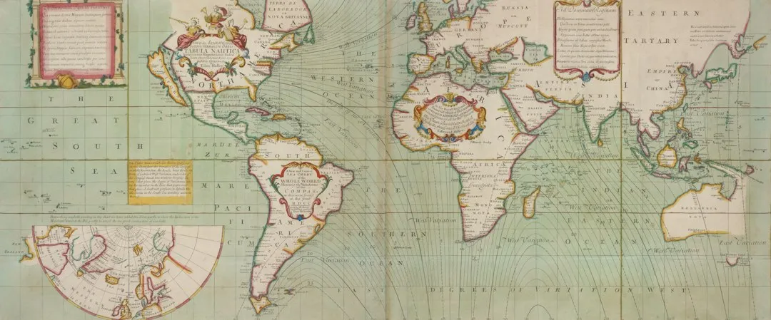
The Mercator projection is a conformal cylindrical map projection first presented by Flemish geographer and mapmaker Gerardus Mercator in 1569. In the 18th century, it became the standard map projection for navigation due to its property of representing rhumb lines as straight lines. It was a brilliant tool for sailors, but it carries a significant cost.
On the Mercator projection, north is always north and south is always south, and countries are in the right place relative to each other and remain roughly the right shape, but in order to take a sphere and make it into a rectangle, cartographers need to distort the map. In practice, this means that the further away from the equator a landmass is, the more its area appears bigger than it actually is.
Mercator maps stretch the world into a rectangle, badly distorting distances toward the poles – Greenland looks as big as Africa but is a fraction of the size. It’s a projection built for compass navigation, not for understanding true global distances.
Great Circle Routes: The Geometry Behind the Curve
A great circle is any circle drawn on a sphere whose center is the center of the sphere – the equator is one, and so is any line of longitude. The key property is that the shorter arc of the great circle connecting two points is the shortest possible path between them along the surface. For a globe, that’s the equivalent of a straight line.
A great circle is the shortest path between two points on the surface of a sphere, and can be defined as any circle that divides the sphere into two equal halves and is centered on the sphere’s center. Think of it like stretching a rubber band across a globe. Where it naturally sits, pulled tight between two cities, is the great circle route.
Why the Curve Looks More Extreme Near the Poles
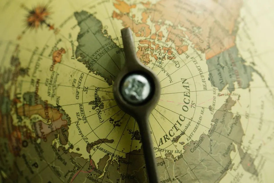
On a flat map, the great circle bends toward the nearer pole, and the further apart the two cities are, the more dramatic the bend becomes. Short flights barely show this effect. Long-haul routes make it unmistakable.
The appearance of a great circle on a flat map depends on the route’s proximity to the equator. Routes passing close to the equator will appear as a straight line, while routes further away will appear as much more of an arc. That’s why a flight from Singapore to Kuala Lumpur looks perfectly straight while New York to Tokyo looks like it’s heading toward the Arctic.
A Real Example: New York to Tokyo
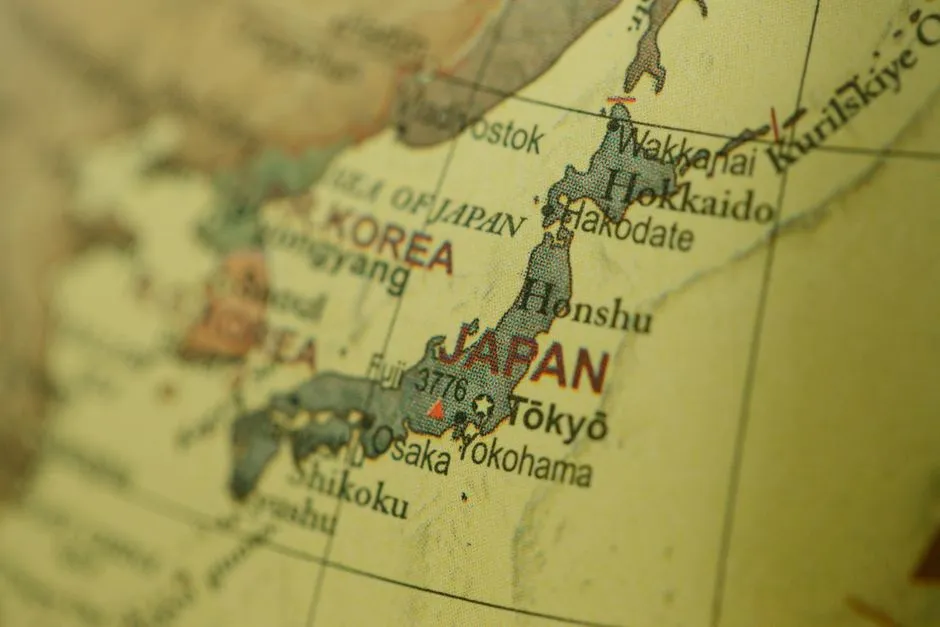
Pull up a flight from New York to Tokyo on a map and the route arcs way up over the Arctic instead of heading straight across. To most people, this reads as a roundabout path. In reality, it’s the tightest line available on a spherical surface.
A straight line drawn on a stretched Mercator rectangle, called a rhumb line, is genuinely longer than the great circle. New York to Tokyo along a rhumb line is hundreds of miles further than the polar great-circle arc airlines actually fly. That’s not a minor difference – it’s the difference between an efficient flight and a costly detour.
The Rhumb Line: What Straight Actually Means on a Flat Map

A great circle connecting two points is the shortest distance, but it requires frequent heading changes throughout the journey. A straight line, or rhumb line, drawn on a Mercator projection map produces the constant compass bearing to follow for the same journey, which is easy to draw and much easier to follow. Sailors historically preferred rhumb lines for exactly this reason.
A rhumb line course is preferred in marine navigation because it is easier for a ship to sail in a constant compass direction to reach its destination, even though it will be a bit further than a great circle route. For short distances, the difference between the rhumb line and great circle route is negligible. Over thousands of miles, however, those differences add up enormously.
How Airlines Use Great Circle Routes in Practice
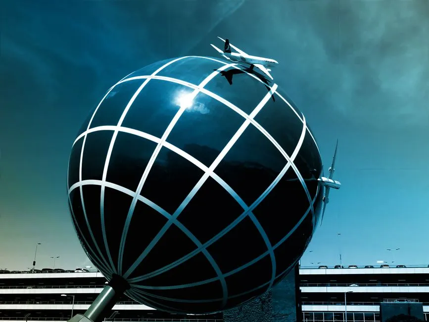
When planning long-haul flights, airlines strategically follow great circle routes to optimize fuel efficiency and reduce travel time. Route planners don’t do this casually. Every degree off a great circle costs real money and real fuel.
Many airline routes appear to curve dramatically when viewed on a world map. Flights between Europe and North America, for example, often arc far north toward Greenland or Iceland instead of following a straight east-west line. Major global hub airports have leveraged their strategic positions on great circle routes to facilitate efficient passenger and cargo flows between continents.
Jet Streams: The Other Force Shaping Flight Paths
Jet streams are fast-flowing, narrow bands of zonal wind that are crucial for aviation because they can affect flight times by providing headwinds or tailwinds at cruising altitudes. They don’t define the great circle geometry, but they heavily influence which version of a route airlines choose on any given day.
Flying with the jet stream can reduce flight times and save fuel, while flying against it can lead to delays and increased fuel consumption. Airliners flying eastward across the Atlantic or Pacific often use the jet’s tailwinds to save time and fuel. A strong winter jet can shorten a trans-Atlantic flight by more than 30 minutes.
Flight planners track daily wind maps at 250 hPa to adjust routes. The North Atlantic Organized Track System shifts eastbound and westbound corridors each day according to the jet’s location. The effect is so significant that fuel savings can reach thousands of kilograms per flight.
Polar Routes: When the Curve Goes All the Way North
Polar routes are flight paths operating near or over the Earth’s polar regions. These routes are commonly used for long-haul flights between Northern and Southern Hemisphere regions, offering shorter flying distances and reduced fuel consumption compared to traditional equatorial routes.
Trans-Arctic air routes have emerged as some of the fastest and most fuel-efficient paths between North America and Asia. By flying directly across the uninhabited Arctic ice cap, commercial aircraft reduce fuel consumption, flight time, and carbon emissions, making these routes increasingly attractive from both economic and environmental standpoints.
As air traffic over the Arctic is projected to double by 2030, continued coordination between nations and modernization of polar aviation protocols will be essential to manage growth responsibly.
Why This Matters Beyond Aviation
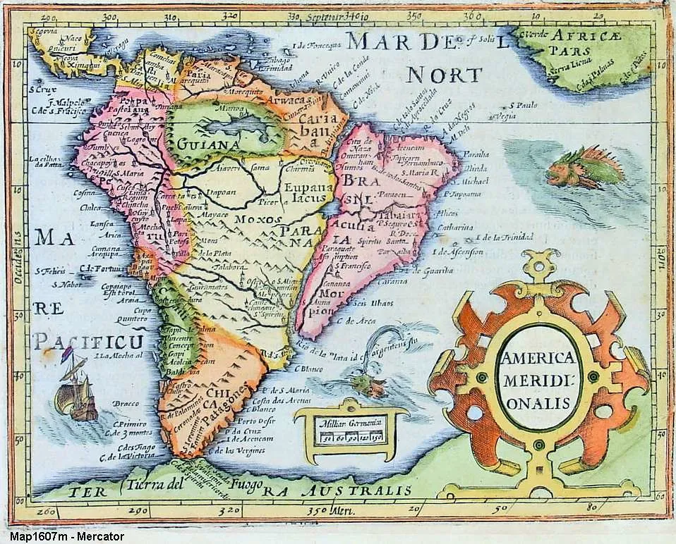
Two-dimensional map projections, like Mercator, distort our perception of distance and routing, making flight paths appear unusual when they are, in fact, the most direct. This isn’t just an aviation curiosity. It points to something broader about how we interpret visual information.
The basic Mercator projection yields the only map on which a straight line drawn anywhere within its bounds shows a true direction, but distances and areas on Mercator projection maps are grossly distorted near the map’s polar regions. It was designed for one purpose and has been used for everything ever since, quietly shaping how billions of people picture the world.
The Takeaway
The curved flight path on your map isn’t a quirk of airline routing or a technical glitch. It’s a window into the genuine geometry of our planet, distorted only by the limitations of translating a sphere onto a flat page. Flight paths look curved because the shortest route over a round Earth projects as a curve when you flatten the globe onto a rectangular map. The plane is flying about as straight as it can – it’s the map that’s bending the truth.
Once you understand this, the arc on that seat-back screen stops looking like an inefficiency and starts looking like what it truly is: the most elegant path available on a round world, rendered imperfectly on a flat one. The Earth knew the right route all along. The map just had trouble showing it.
AI Disclaimer: This article was created with the assistance of AI tools and reviewed by a human editor.